In the age of social media, narratives can spread far faster than facts. This is particularly true regarding accounts like @xIsraelExposedx, which present themselves as definitive archives of conflict data. However, when we pull back the emotional rhetoric and actually look at the numbers, the claims being pushed quickly fall apart.
1. The Civilian-to-Combatant Ratio is Roughly 1:1
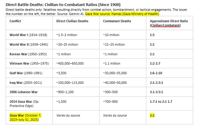
A central claim in accusations of “genocide” is that military operations are indiscriminate, resulting almost entirely in civilian casualties. However, the data says otherwise. According to Hamas’ own data, the civilian-to-Combatant ratio hovers around 1:1. In urban warfare—where combatants actively embed themselves within civilian infrastructure—a 1:1 ratio is historically low. It demonstrates a targeted effort to strike combatants rather than an attempt to eliminate a population wholesale.
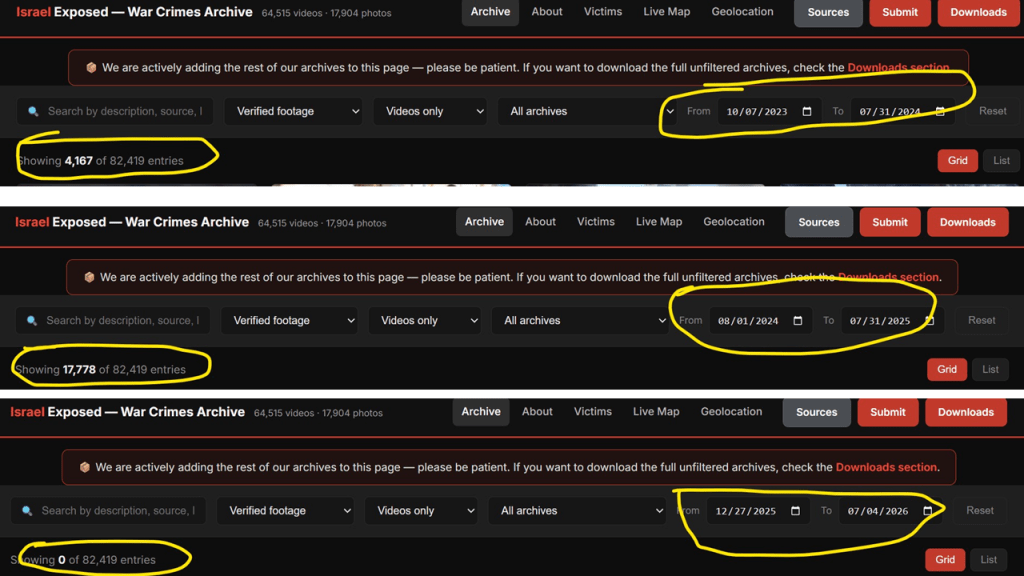
2. A Total Lack of Recent Activity
For an archive supposedly tracking active, ongoing crises, the data logs show a grinding halt. When looking closely at the specific date filters on their database:
– From 10/07/2023 to 07/31/2024, they show 4,167 entries.
– From 08/01/2024 to 07/31/2025, they list 17,778 entries.
– However, looking from late 2025 into mid-2026, there are exactly 0 incidents logged.
If an active “genocide” were taking place, an archive tracking it wouldn’t suddenly drop to zero incidents over an extended period.
Note: Unverified claims are not included in this analysis for obvious reasons.
3. The Math Behind the Surge: Intense Conflict vs. Genocide
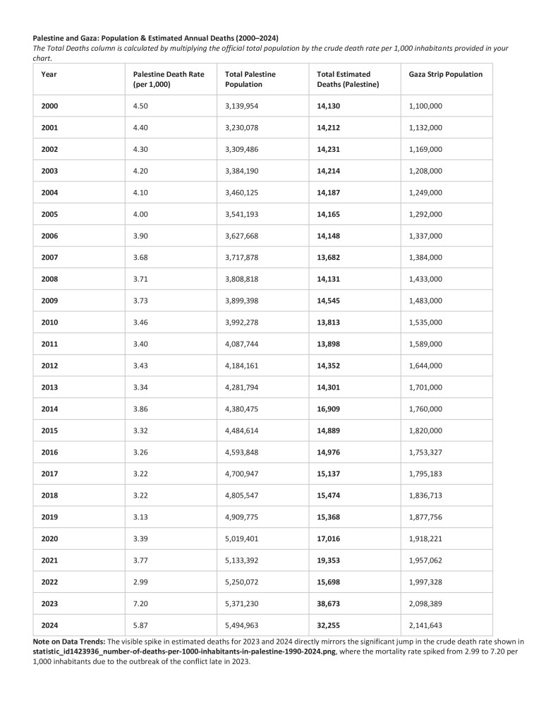
To understand the scale of the tragedy, we have to look at historical baselines. In the screenshot showing Gaza Deaths 2000-2024 (source: Statista) we can track the population growth and estimated annual deaths in the region over two decades. Between the years 2000 and 2020, Gaza experienced an average baseline of roughly 5.5K deaths per year. Following the events of October 7, data shows approximately 30,000 civilian deaths over a 22-month period. This breaks down to an average of 16.5K deaths per year during the height of active hostilities.
Post-10/7 Annual Rate: 16.5K deaths/yr
Historical Baseline: – 5.5K deaths/yr
—————————————-
Net Increase: 11.0K deaths/yr
An annual jump of 11K deaths is undeniable proof of a severe, intense military conflict. But it does not align with the statistical definition or reality of a “genocide” aimed at destroying a population of over 2 million people. War brings tragic surges in mortality, but conflating an intense urban war with systemic eradication completely misrepresents the data.
The Bottom Line: When accounts use massive archives to overwhelm audiences, it’s vital to look past the presentation and evaluate the numbers. The data shows a highly intense conflict with a 1:1 civilian-to-combatant ratio—not a genocide.

You must be logged in to post a comment.